Nashville Predators Identity
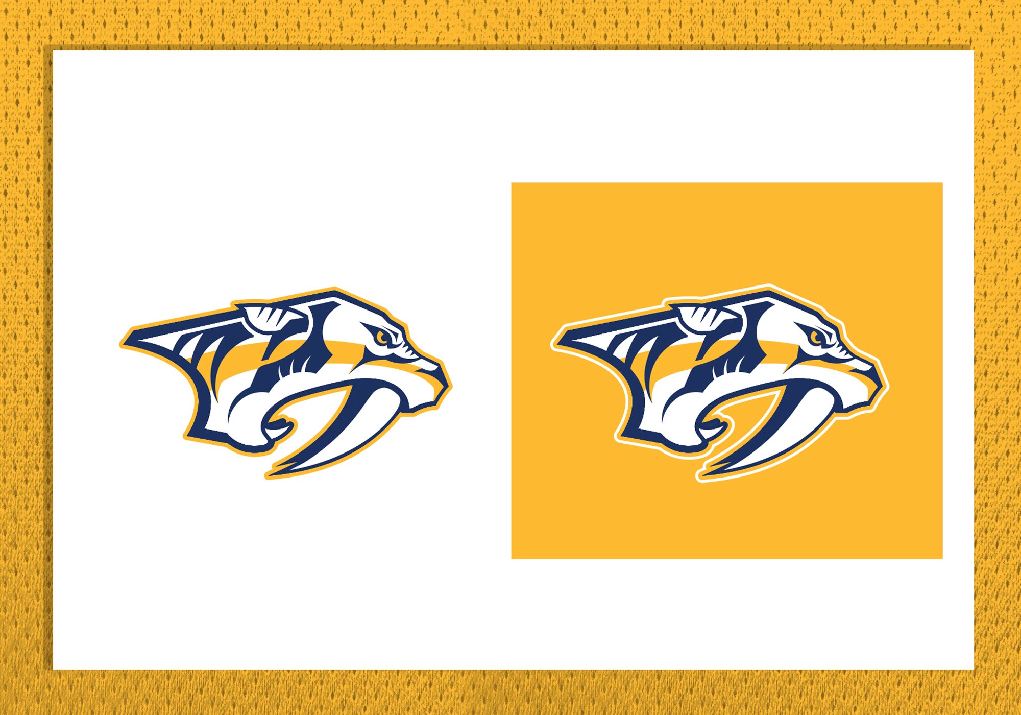
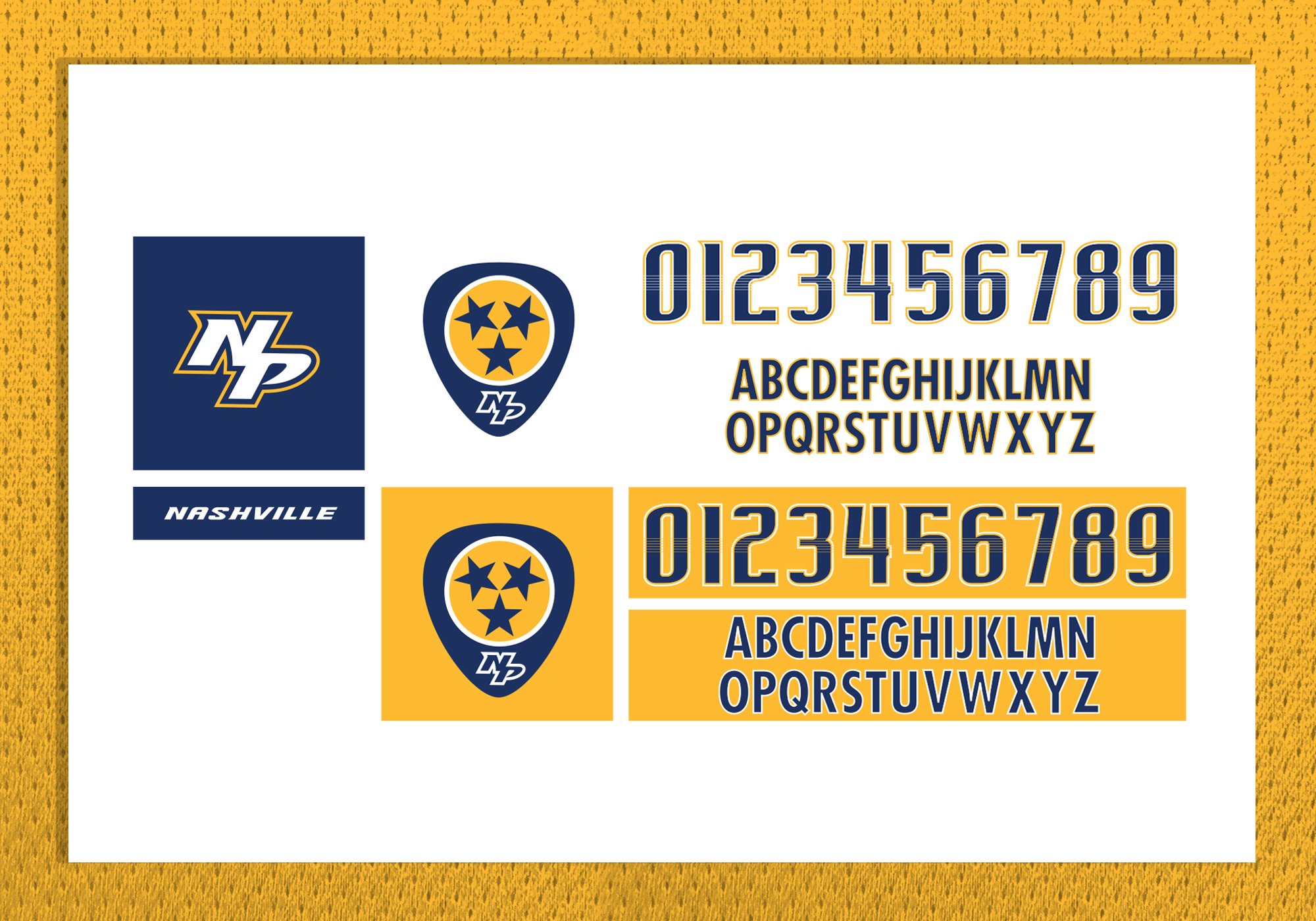
I led the Reebok NHL design team through the Nashville Predators rebranding process. The new identity included introducing “Predator Gold” has their new primary color, a more contemporary Predators logo design, a new wordmark, secondary mark, ligature and established various design markers connecting to Nashville’s music heritage.
Smashville Ready.
The logo and uniforms were designed to develop a powerful, long-term brand message and help infuse new life into the Nashville Predators imagery with a more contemporary, aggressive, streamlined logo that still maintains the basic Pred Head concept. A new secondary logo was also designed to represent the state flag of Tennessee and Nashville's Music City heritage.
Behold the Gold.
The "Predators Gold" sweaters create a distinctive, dominant, bold look that balances traditional elements of classic uniforms with those unique to Nashville—guitar strings in the numbering and lettering, fangs in the neck area and piano keys on the inside of the collars. A guitar pick shoulder patch has three stars in the center of the logo, which symbolize that this is a hockey team for the entire state.
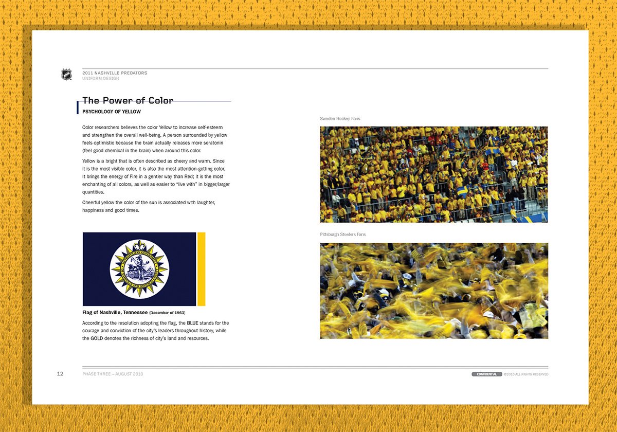
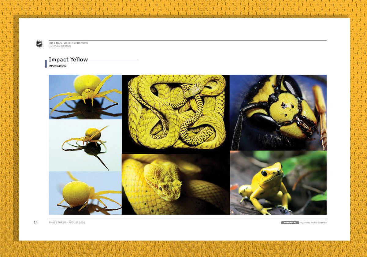

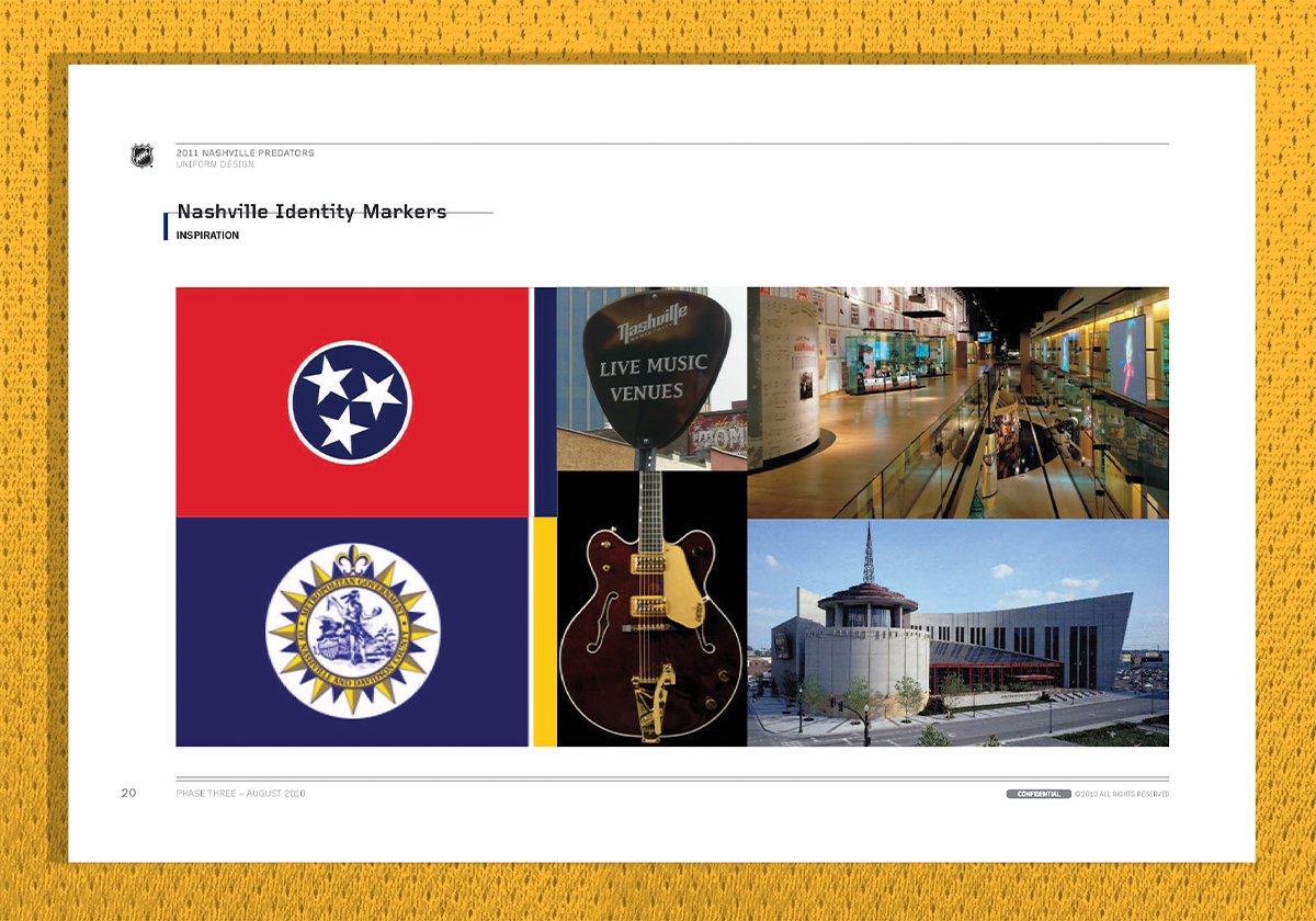
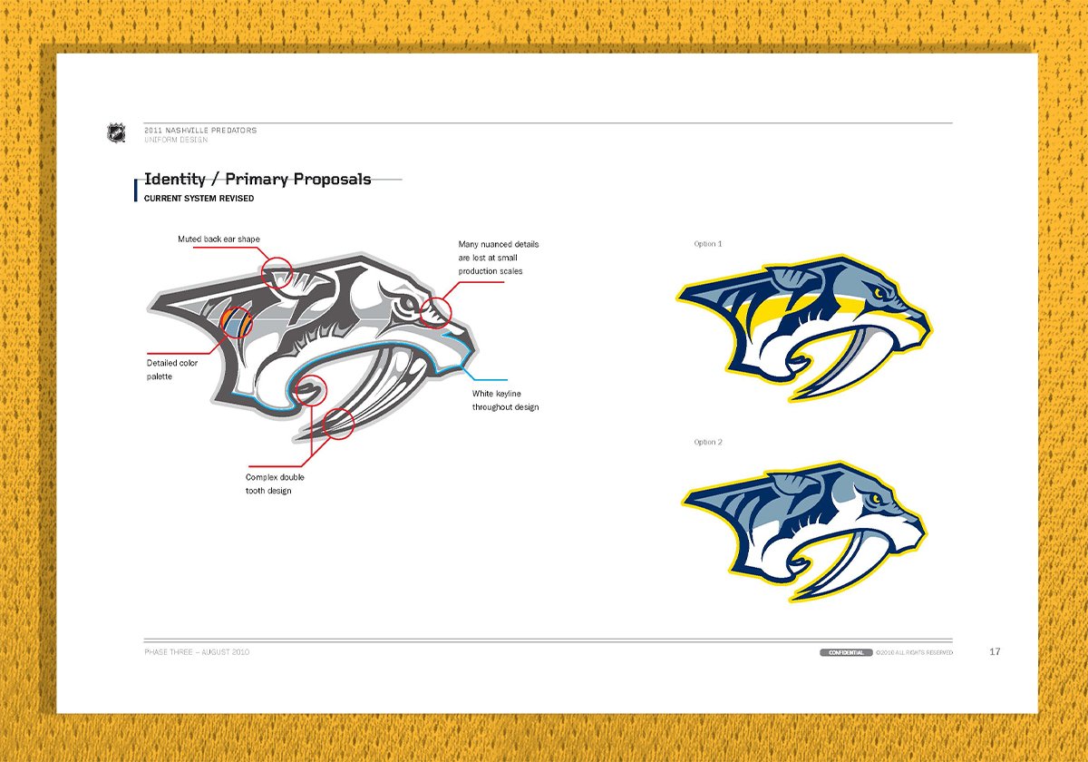
Nashville Predators Uniform Design.
A distinctive, dominant, bold look that balances traditional elements of classic uniforms with those unique to Nashville.


On the Attack.
Various real-life examples of the new Nashville Predators identity. The rebrand helped to elevate the brand and create brand awareness in an untraditional hockey market.


