Winnipeg Jets Identity
In the late spring of 2011, I had the privilege of leading the Reebok NHL design team through the Winnipeg Jets identity development process. Working very closely with owner Mark Chipman, True North and the NHL, we delivered the Jets' complete, new identity in 30 days. The new identity included naming, primary and secondary marks, wordmark, jersey design and a new color palette.
Welcome Home.
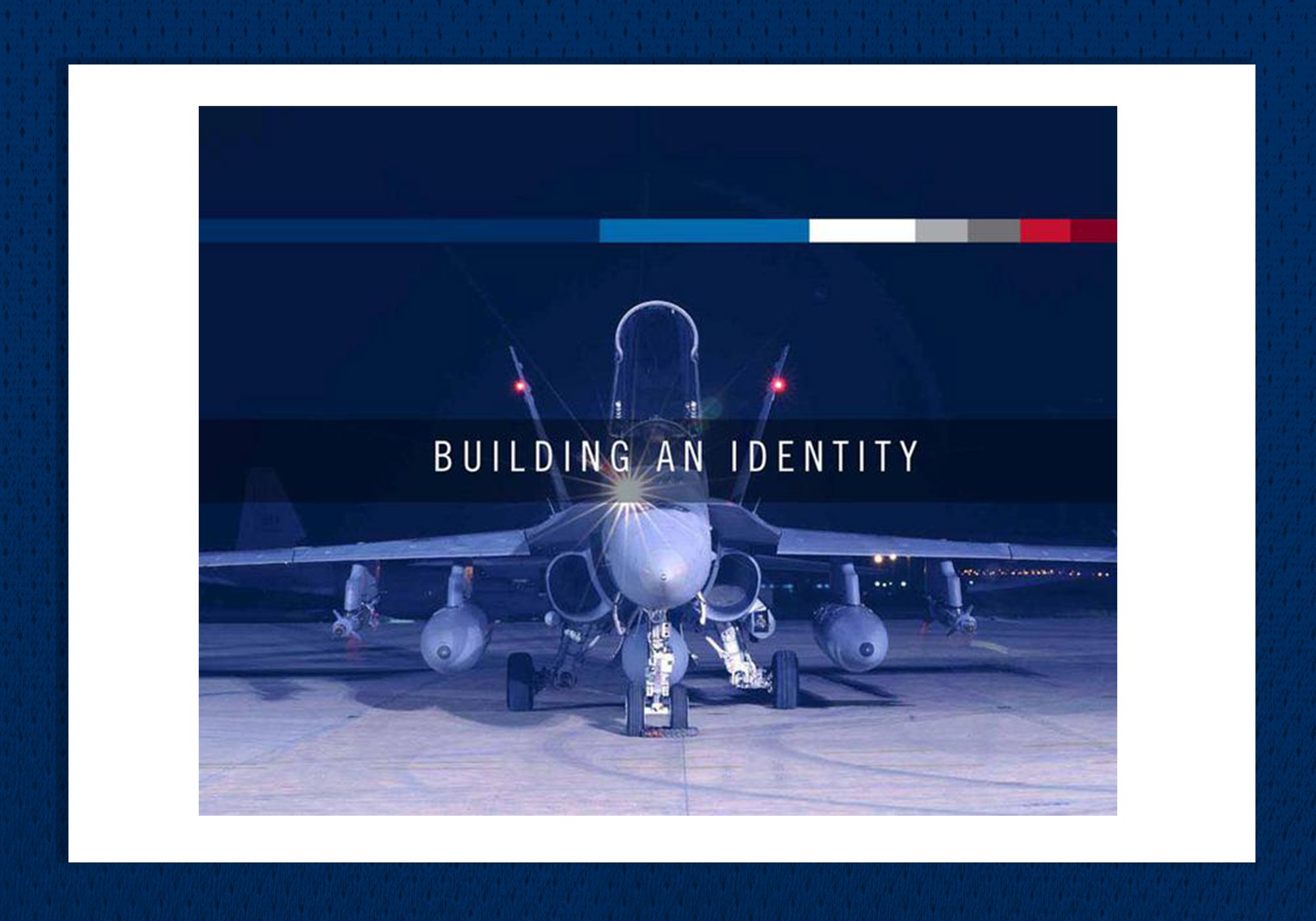
The Winnipeg Jets identity is designed to honor the city’s rich history and the Royal Canadian Air Force, which inspired the primary crest design. These jerseys signify not only the presence of the NHL in Winnipeg after a 15-year absence, but of Winnipeg's presence in Canada, North America and around the globe.
Building the Jets.
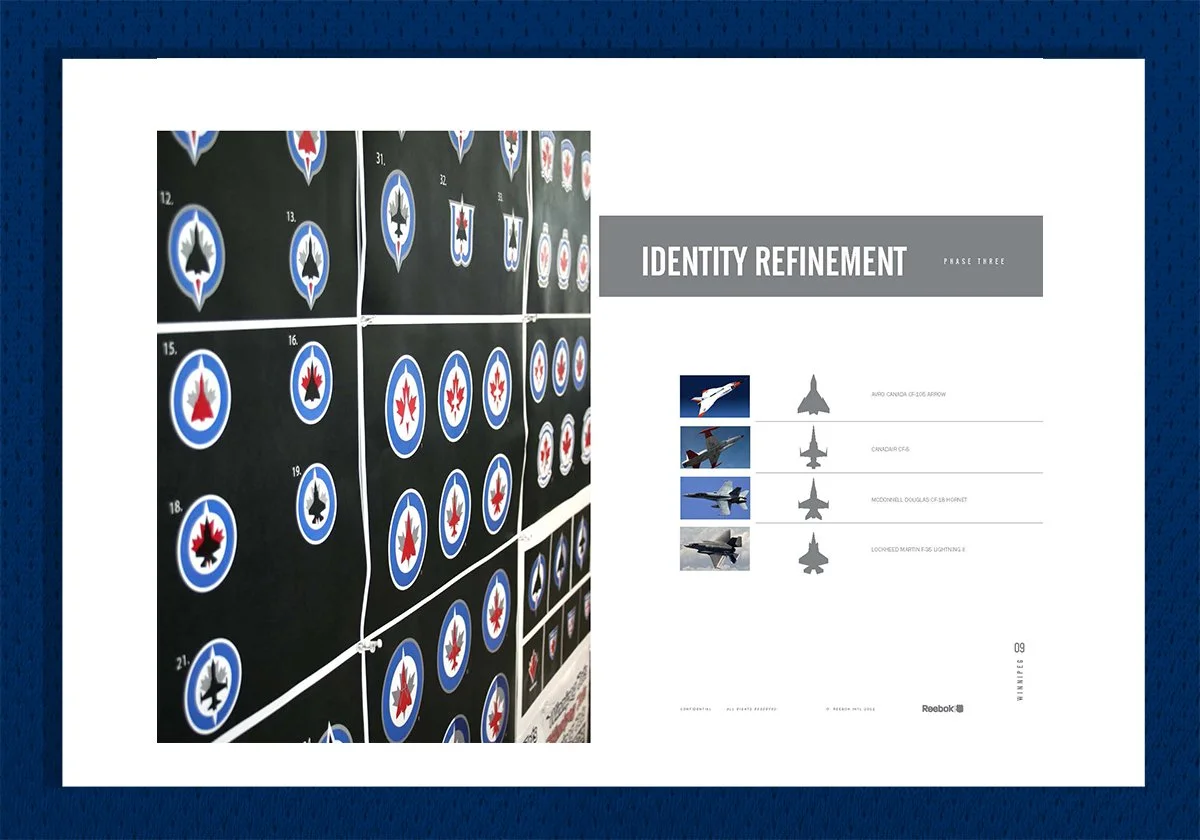
Inspired by the city’s rich history and deep connection with the Royal Canadian Air force, the new logo shows a sleek fighter jet pointing north over a red maple leaf, all inside a navy blue and grey circle known in military terms as a roundel. The jerseys consist mostly of two shades of blue: Polar Night Blue, found on many of today's RCAF aircraft, and Aviator Blue, which is similar to colors used historically by the RCAF.


Winnipeg Jets Uniform Design.
A timeless uniform design with colors, stripes and a number system inspired by aeronautics.
“We felt it was important to authenticate the name Jets, and we believe the new logo does that through its connection to our country’s remarkable Air Force heritage.”
— Mark Chipman, Owner of the Winnipeg Jets


Ready for Takeoff.
Various real-life examples of the Winnipeg Jets identity. The new branding refueled the Winnipeg Jets fan base with a deep passion for their new hockey team.


