Dallas Stars Identity
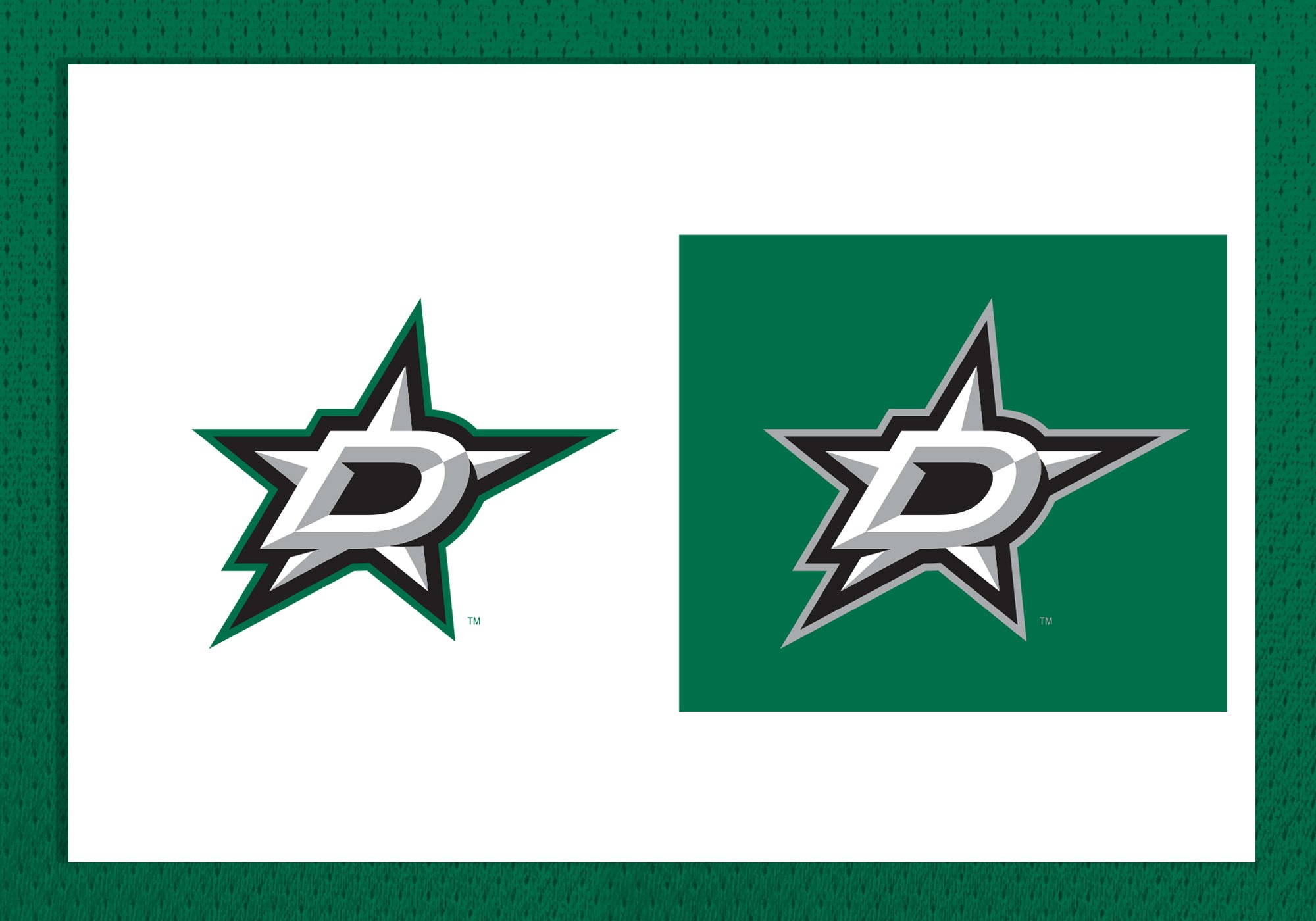
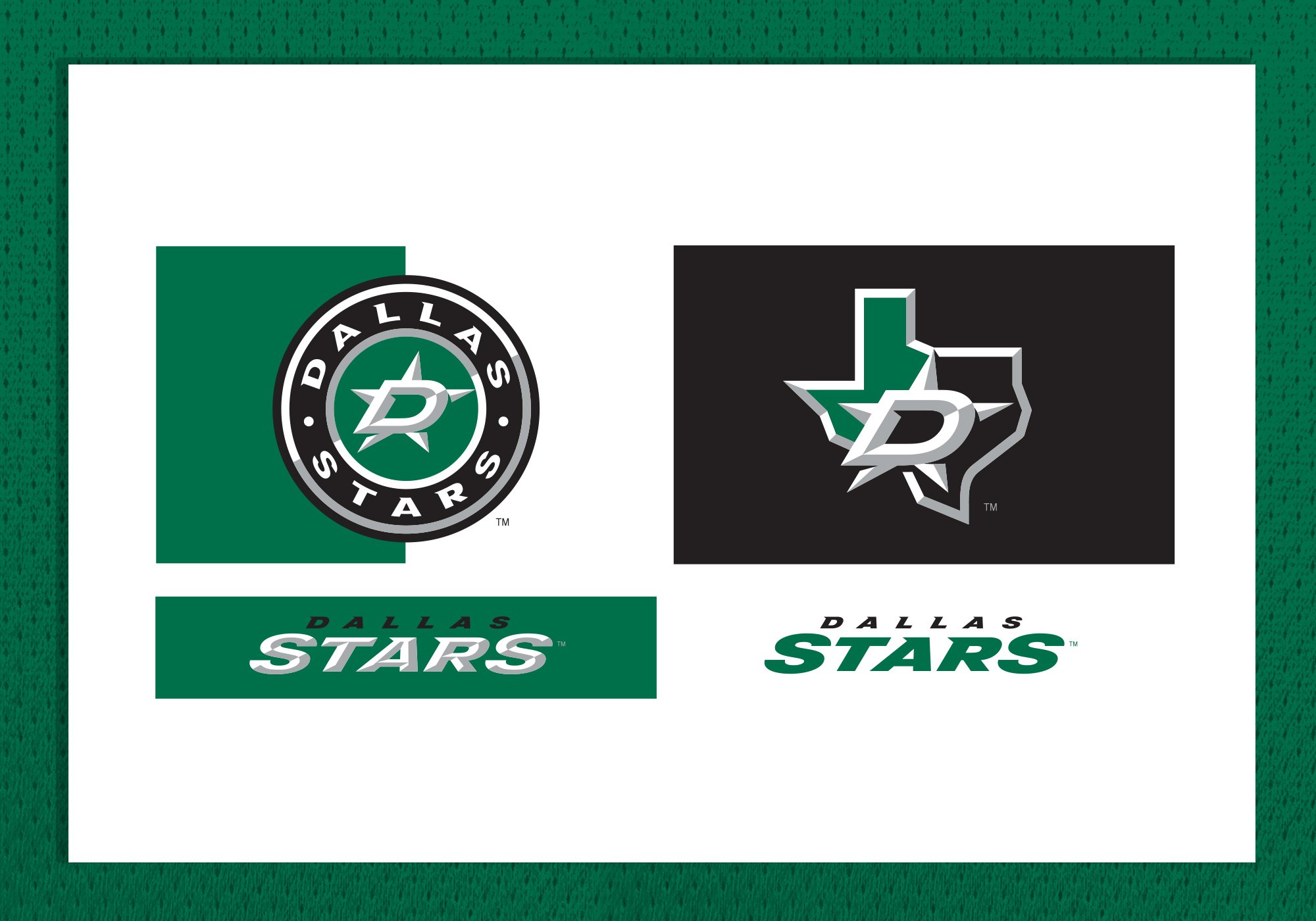
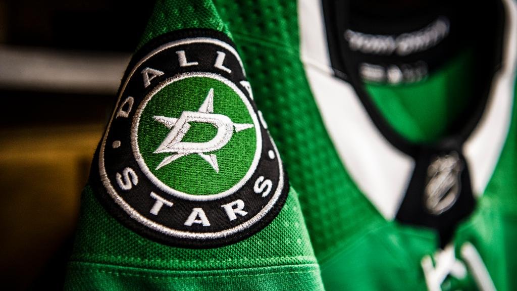
I led the Reebok NHL design team through the Dallas Stars rebranding process. The new identity included the creation of a new primary, secondary and tertiary mark, new wordmark, new uniforms design and the introduction of “Victory Green” has their new primary color.
The Big D.
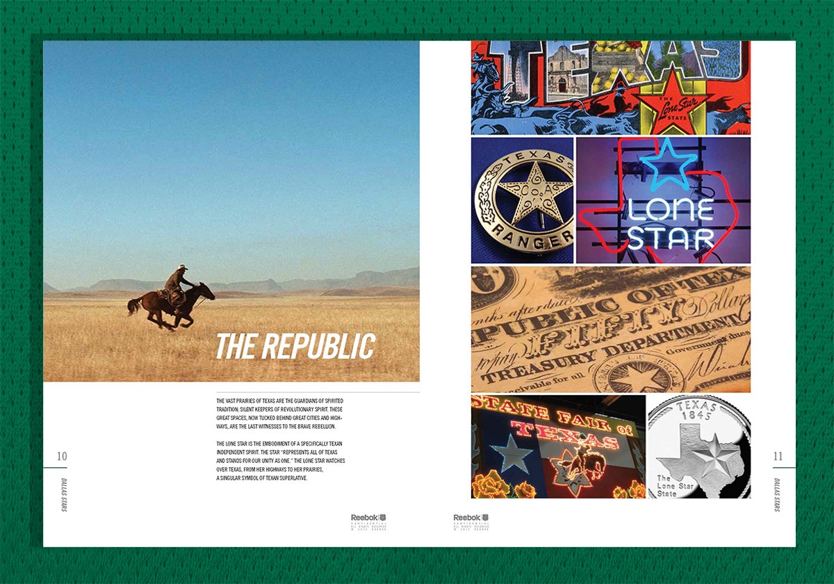
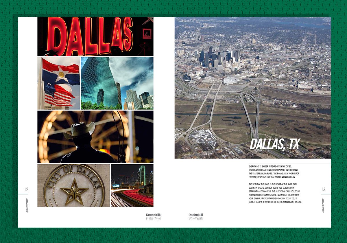
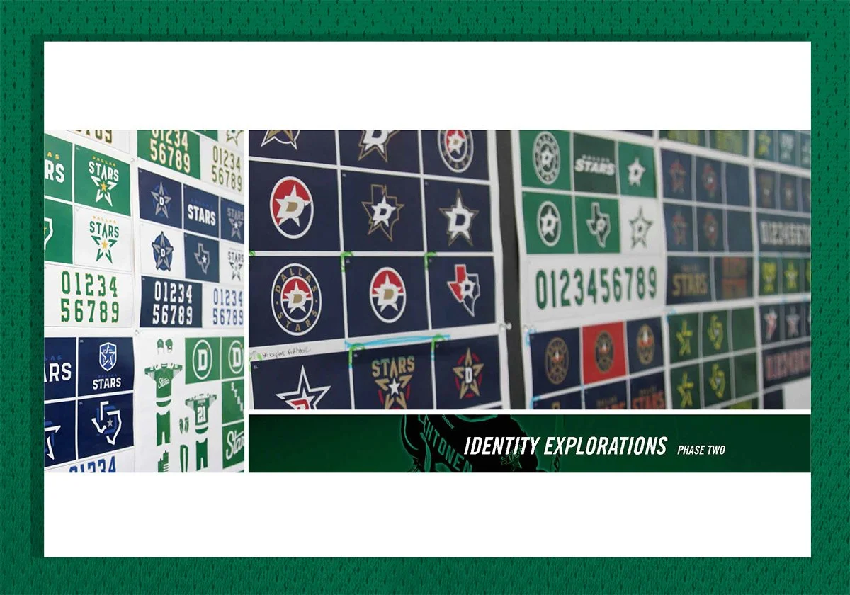
When we started to engage with the Dallas Stars executive group, they knew they wanted to rebrand and were open to changing the color scheme. Through this process, we explored hundreds of logos, various color combinations, jersey prototypes and gathered fans and Stars employees' feedback. The end result was a new identity built around the Big D, which represented proudly the great state of Texas.
Victory Green.
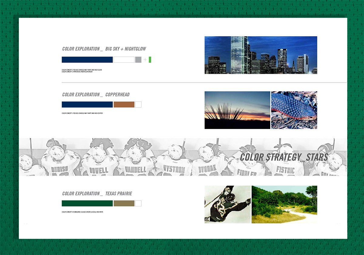
The executive team really wanted to change the colors of the Stars and heavily considered blue as their primary color. Following some market exploration, we outlined the opportunity to better stand out in the Texas market through the usage of green—fans' feedback supported our opinion. From there we introduced “Victory Green,” a crisper shade of green that translated well on merchandise and TV broadcasts.

Dallas Stars Uniform Design.
A classic jersey with lace up collar and unique shoulder cowl, made for Dallas.
“There’s only one Big D, so I feel the logo will be pretty easily recognizable. I love its simplicity.”
— Tom Gaglardi, Owner of the Dallas Stars




Shining Bright.
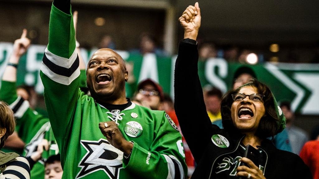
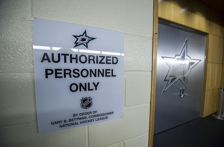
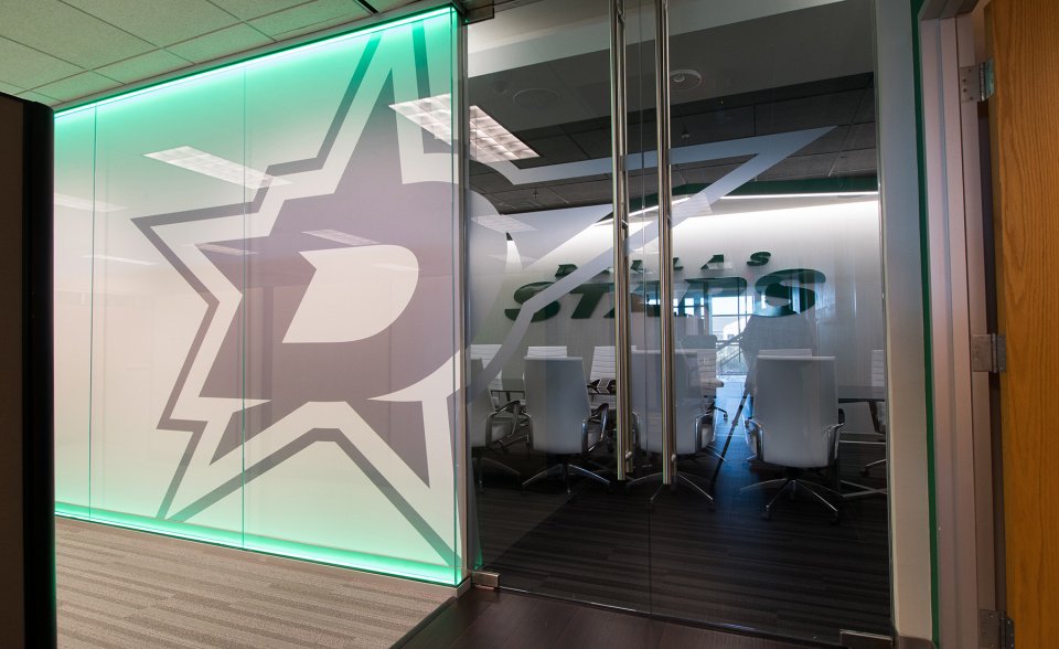
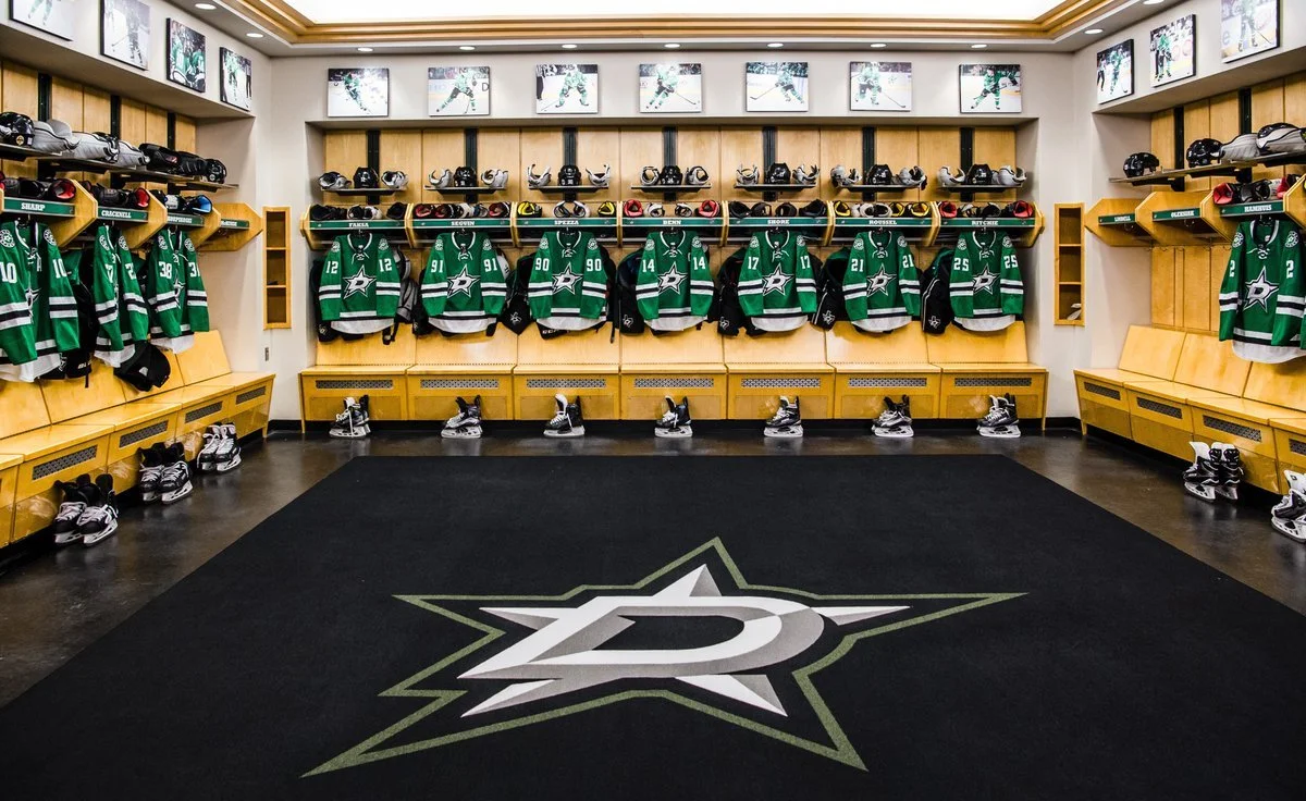
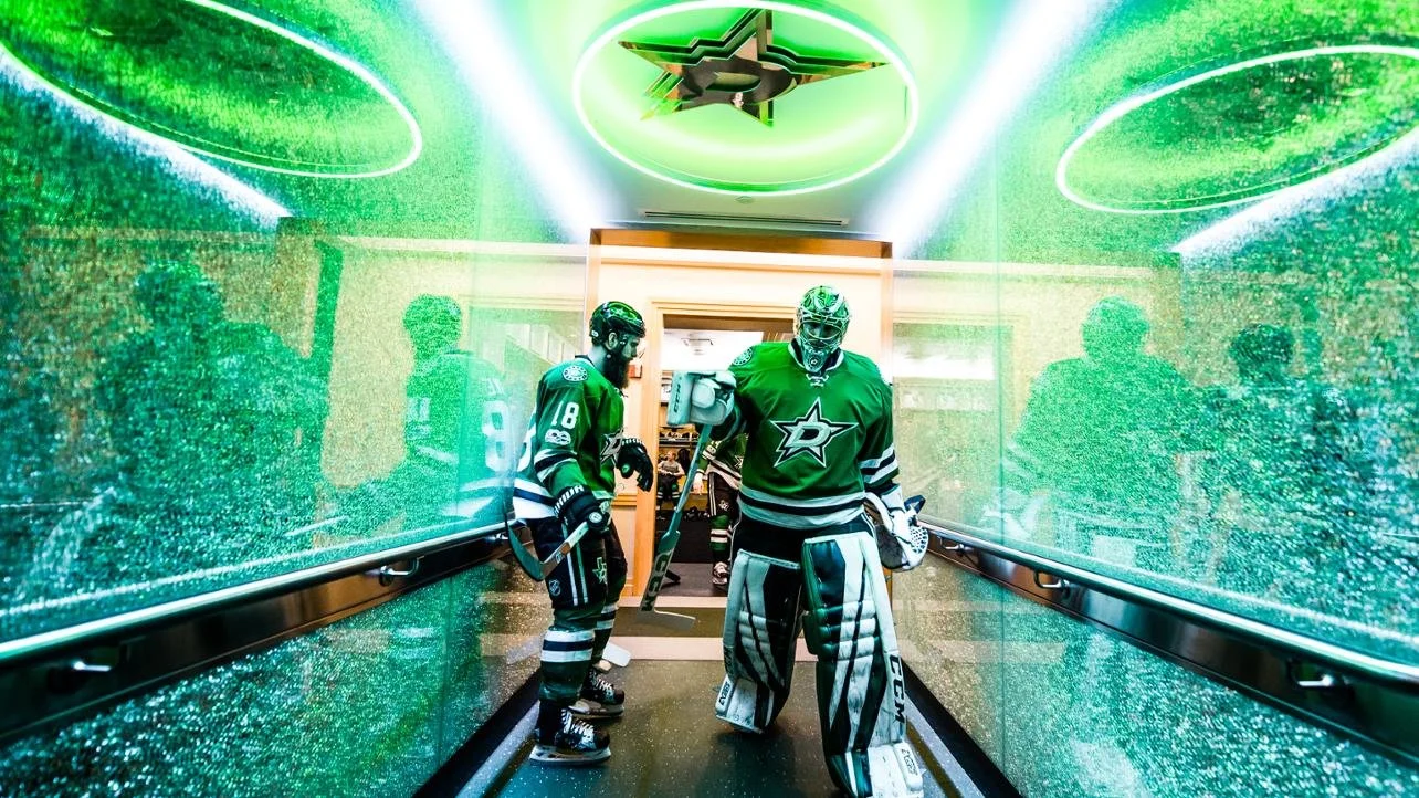
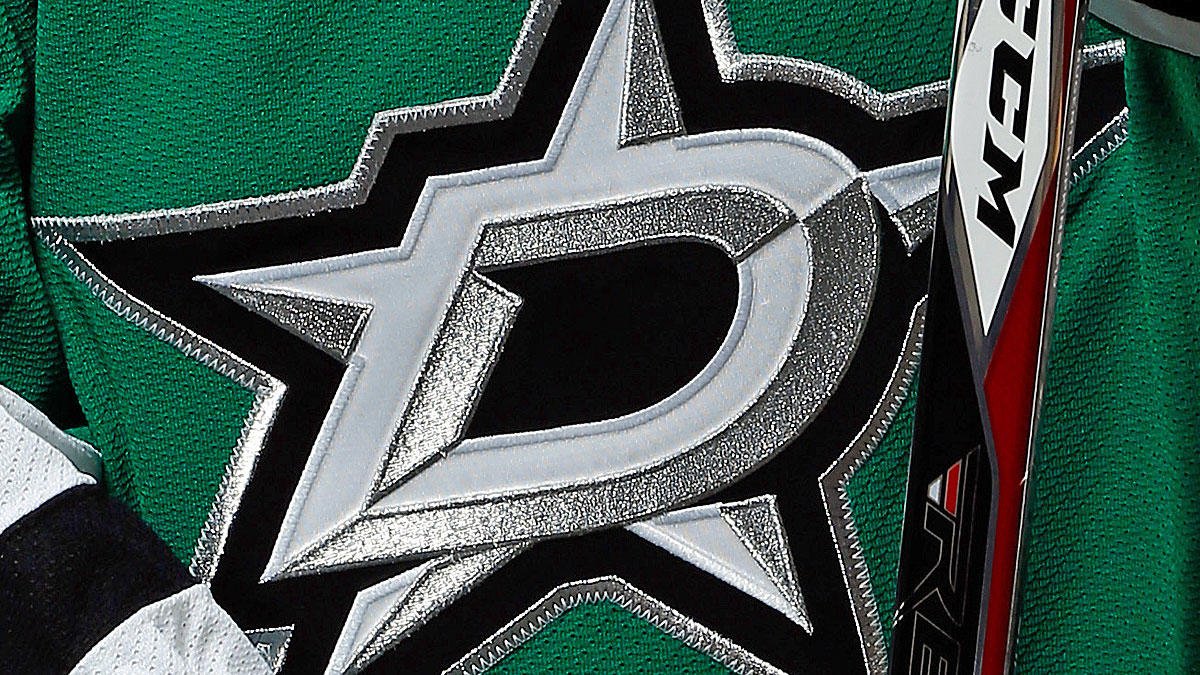
Various real-life examples of the new Dallas Stars branding. The new branding helped to elevate the Stars brand, setting a new hockey tradition in Texas.
