Florida Panthers Identity
The Florida Panthers wanted to rebrand the franchise—the first major change since entering the league in 1993. Following an intro meeting at the ownership’s offices in NYC, I led the Reebok NHL design team by working closely with the Panthers’ ownership and NHL executives to build a new identity system representing the core values of a winning organization.
Florida Proud.
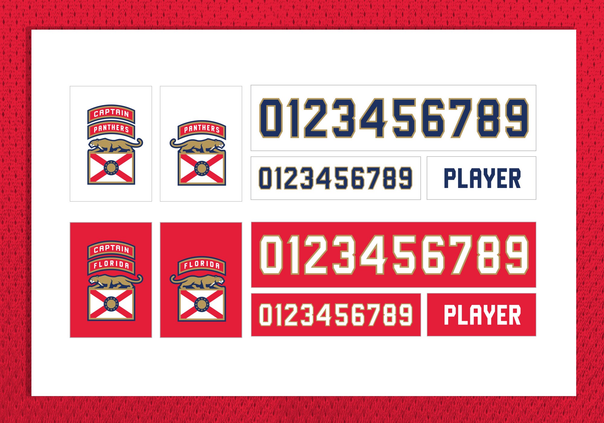
While taking some military inspiration from the Army's 101st Airborne Division, in which the Panthers’ owner served, we wanted to establish a new tradition for Florida hockey. To help complement the new uniform design, we evolved the stylization of the logo and created a modern approach to the patches and numbering system.
A New Look.
We created a new look by evolving the color strategy to a more premium palette, introducing a new elevated panther shield and moving away from the leaping Florida panther, and establishing a new tradition by re-inventing a classic jersey design and creating a modern patch and number system.

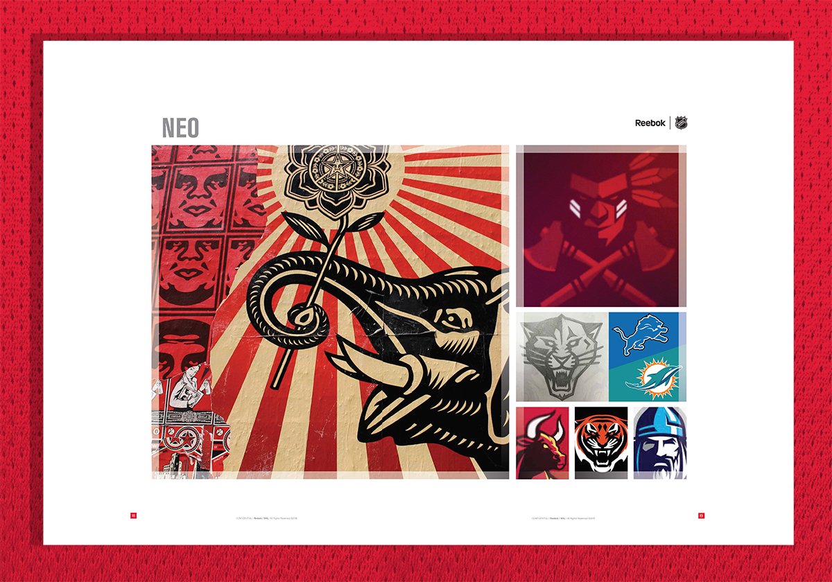
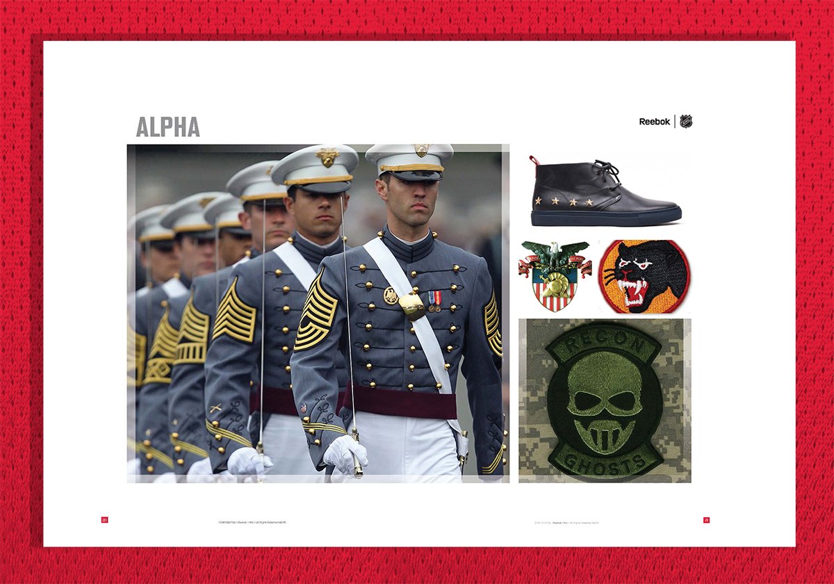


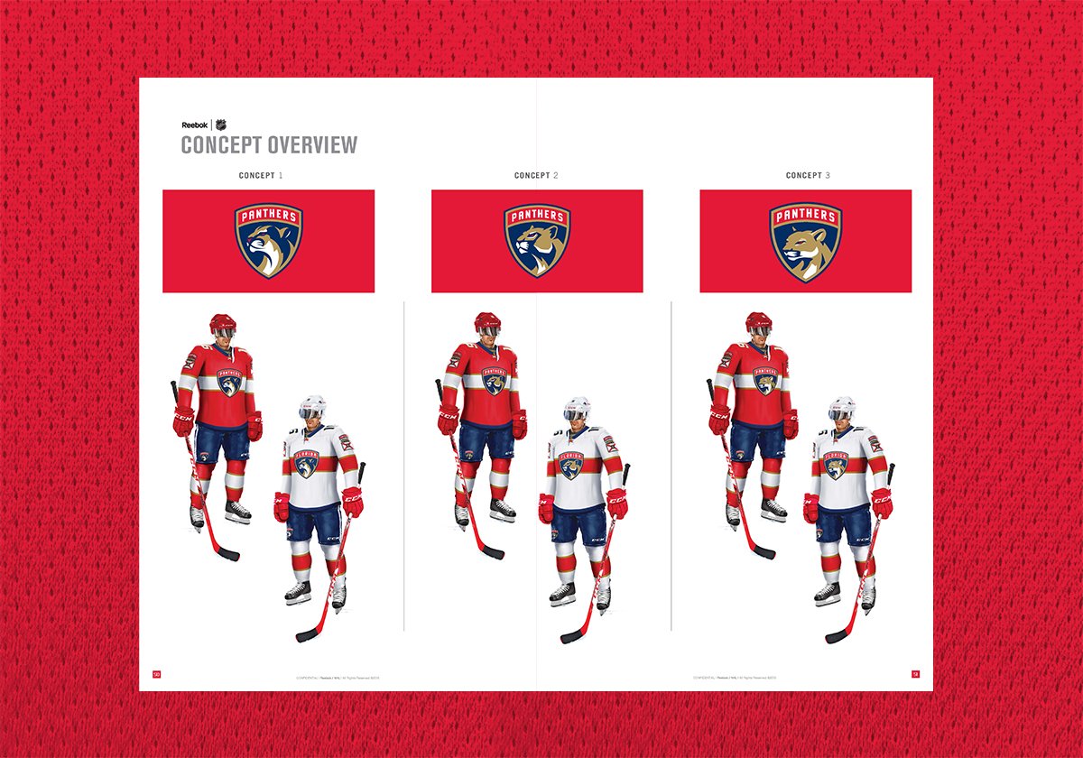
Florida Panthers Uniform Design.
A traditional jersey, with a Florida flag-inspired lace up collar and accentuated by a modern patch and number system.
“I think the logo harkens to the vanguard of courage; the idea that you put a shield on the hockey uniform. We wanted something that began a new tradition of winning and demonstrated courage and selfless dedication to a team pursuit of victory.”
— Vinnie Viola, Owner of the Florida Panthers



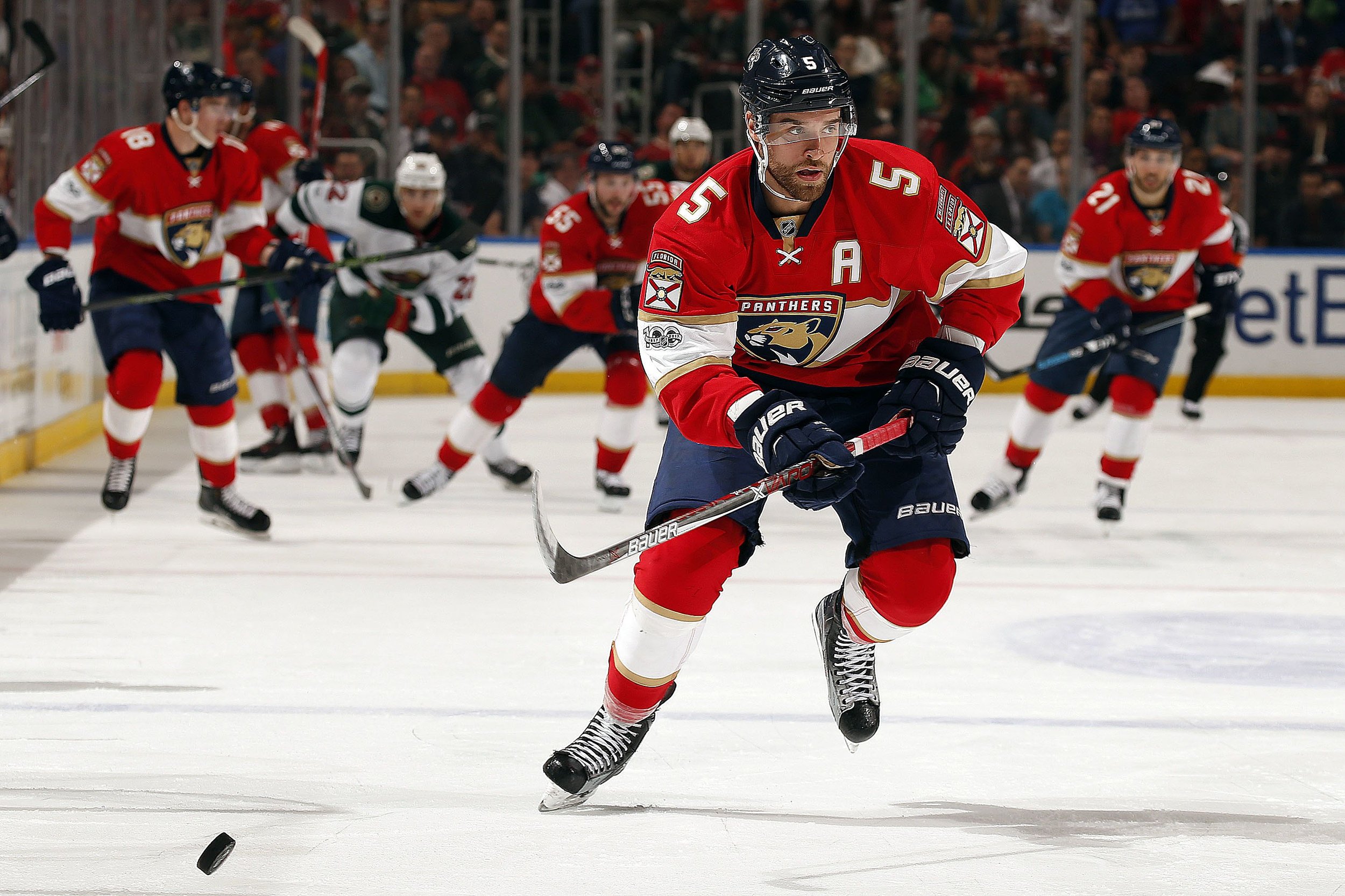


Panthers Territory.
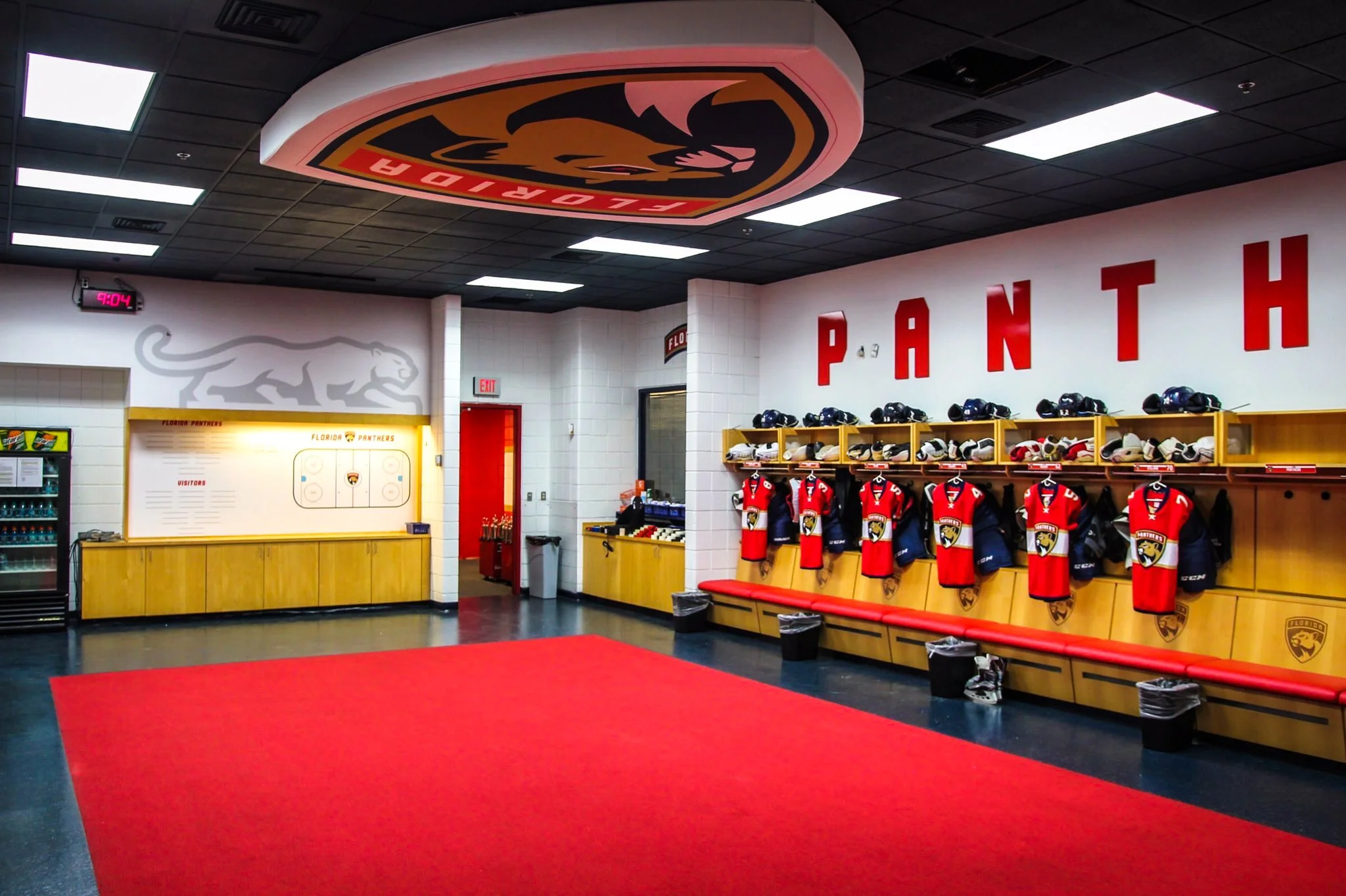
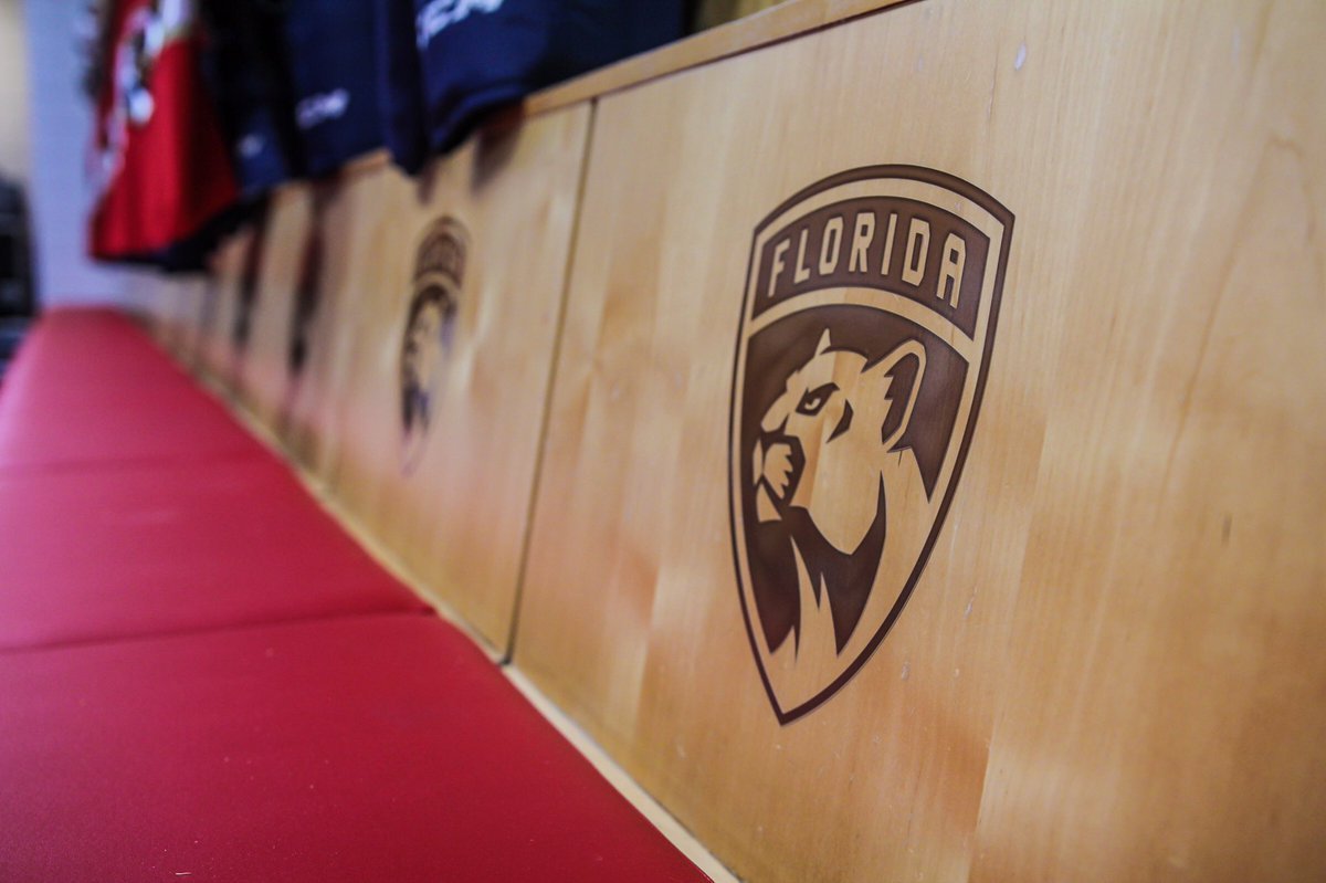
Various real-life examples of the new Florida Panthers branding. The rebranding helped to elevate the brand and create a new hockey tradition in Florida.

